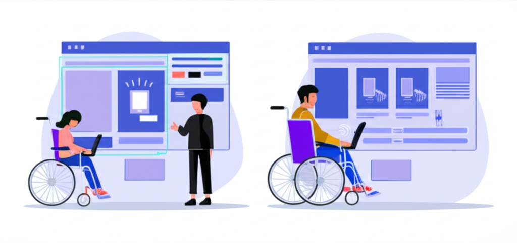
Building Accessible Web Applications: A Complete Guide
Creating web applications that are accessible to all users, including those with disabilities, is not just a legal requirement in many jurisdictions—it's a moral imperative and good business practice. This comprehensive guide will walk you through the essential principles and techniques for building truly accessible web applications.
Why Accessibility Matters
According to the World Health Organization, over 1 billion people worldwide live with some form of disability. That's approximately 15% of the global population. By building accessible applications, you're not only expanding your potential user base but also creating a more inclusive digital world.
Beyond the ethical considerations, there are compelling business reasons to prioritize accessibility:
- Expanded market reach to users with disabilities
- Improved SEO (many accessibility practices align with SEO best practices)
- Reduced legal risk (many countries have digital accessibility laws)
- Enhanced brand reputation
- Better usability for all users, not just those with disabilities
Understanding WCAG Guidelines
The Web Content Accessibility Guidelines (WCAG) are the internationally recognized standards for web accessibility. Currently, WCAG 2.1 is the latest published version, with WCAG 2.2 in development. These guidelines are organized around four principles, often remembered by the acronym POUR:
- Perceivable: Information must be presentable to users in ways they can perceive.
- Operable: User interface components must be operable by all users.
- Understandable: Information and operation must be understandable.
- Robust: Content must be robust enough to work with current and future technologies.
Each principle contains specific guidelines, and each guideline has testable success criteria at three conformance levels: A (minimum), AA (mid-range), and AAA (highest). Most organizations aim for AA compliance as a reasonable target.
Semantic HTML: The Foundation of Accessibility
Using semantic HTML elements is the first and most crucial step in building accessible web applications. Semantic HTML provides meaning to your content, which helps assistive technologies understand and navigate your site.
Here are some key semantic elements and their proper usage:
,,,,,for page structurethroughfor hierarchical headingsfor interactive elements that perform an actionfor navigation to a new page or locationfor lists,
, for tabular data Example: Semantic vs. Non-Semantic HTML
❌ Non-Semantic
html <div class="header"> <div class="logo">Site Name</div> <div class="nav"> <div class="nav-item">Home</div> <div class="nav-item">About</div> </div> </div> <div class="content"> <div class="title">Page Title</div> <div class="text">Content goes here...</div> </div>✅ Semantic
html <header> <h1>Site Name</h1> <nav> <ul> <li><a href="/">Home</a></li> <li><a href="/about">About</a></li> </ul> </nav> </header> <main> <h2>Page Title</h2> <p>Content goes here...</p> </main>ARIA: Enhancing HTML Semantics
Accessible Rich Internet Applications (ARIA) is a set of attributes that define ways to make web content and applications more accessible. ARIA supplements HTML when native semantics aren't enough.
Key ARIA concepts include:
- Roles: Define what an element is or does (e.g.,
role="navigation",role="button") - Properties: Define attributes of elements (e.g.,
aria-required="true",aria-label="Search") - States: Define current conditions (e.g.,
aria-expanded="false",aria-disabled="true")
Important: The first rule of ARIA is not to use ARIA if native HTML can achieve the same result. Always prefer semantic HTML when possible.
Keyboard Accessibility
Many users with motor disabilities, as well as power users, navigate websites using only a keyboard. Your web application must be fully functional without requiring a mouse.
Key considerations for keyboard accessibility include:
- Focus indicators: Ensure all interactive elements have a visible focus state
- Focus order: Ensure the tab order follows a logical sequence
- Keyboard traps: Avoid situations where keyboard focus gets trapped
- Shortcuts: Provide keyboard shortcuts for common actions
Screen Reader Compatibility
Screen readers are assistive technologies that convert digital text into synthesized speech. To ensure your application works well with screen readers:
- Alt text for images: Provide descriptive alternative text for all meaningful images
- Form labels: Ensure all form controls have associated labels
- ARIA landmarks: Use ARIA roles to define regions of the page
- Live regions: Use
aria-livefor dynamic content updates
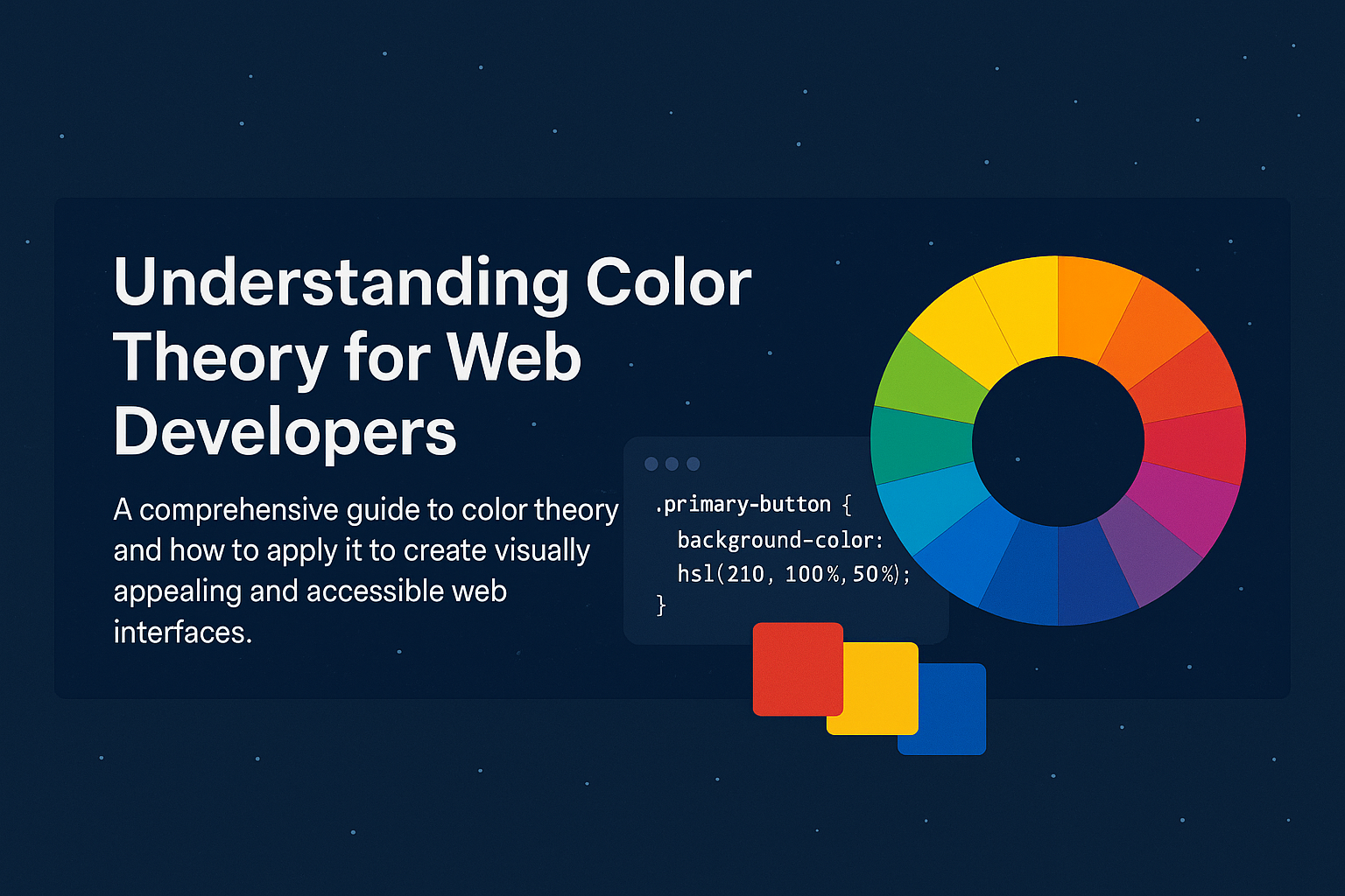
Color and Contrast
Color should never be the only means of conveying information, and text must have sufficient contrast against its background.
- Color contrast ratios: WCAG AA requires a contrast ratio of at least 4.5:1 for normal text and 3:1 for large text
- Color independence: Ensure information conveyed with color is also available through other visual means or text
Responsive Design and Zoom
Users with visual impairments often zoom in on web pages or use the browser at high magnification levels. Your application should:
- Support zooming up to 200% without loss of content or functionality
- Use responsive design principles to adapt to different viewport sizes
- Avoid horizontal scrolling at standard zoom levels
Testing for Accessibility
Accessibility testing should be integrated into your development process. Here are some approaches:
- Automated testing: Tools like Axe, WAVE, and Lighthouse can catch many issues
- Manual testing: Use a keyboard to navigate your site, check focus order, etc.
- Screen reader testing: Test with NVDA, JAWS, or VoiceOver
- User testing: Involve users with disabilities in your testing process
Implementing Accessibility in React Applications
When building React applications, there are specific considerations for accessibility:
- Use semantic HTML elements whenever possible
- Manage focus when content changes dynamically
- Use React fragments to avoid unnecessary DOM nodes
- Consider libraries like react-aria or @reach/ui that are built with accessibility in mind
Example: Accessible Modal in React
jsx import React, { useEffect, useRef } from 'react';function AccessibleModal({ isOpen, onClose, title, children }) { const modalRef = useRef(null); // Trap focus inside modal when open useEffect(() => { if (!isOpen) return; const focusableElements = modalRef.current.querySelectorAll( 'button, [href], input, select, textarea, [tabindex]:not([tabindex="-1"])' ); const firstElement = focusableElements[0]; const lastElement = focusableElements[focusableElements.length - 1]; function handleTabKey(e) { if (e.key === 'Tab') { if (e.shiftKey && document.activeElement === firstElement) { e.preventDefault(); lastElement.focus(); } else if (!e.shiftKey && document.activeElement === lastElement) { e.preventDefault(); firstElement.focus(); } } } // Focus the modal when it opens modalRef.current.focus(); // Add event listeners const modal = modalRef.current; modal.addEventListener('keydown', handleTabKey); // Clean up return () => { modal.removeEventListener('keydown', handleTabKey); }; }, [isOpen]); if (!isOpen) return null; return ( <div className="modal-overlay" onClick={onClose} role="presentation" > <div className="modal" ref={modalRef} role="dialog" aria-modal="true" aria-labelledby="modal-title" tabIndex={-1} onClick={e => e.stopPropagation()} > <div className="modal-header"> <h2 id="modal-title">{title}</h2> <button onClick={onClose} aria-label="Close modal" className="close-button" > × </button> </div> <div className="modal-content"> {children} </div> </div> </div> ); }
Conclusion
Building accessible web applications is a continuous process that should be integrated into your development workflow from the beginning. By following the principles and techniques outlined in this guide, you'll create applications that are more usable for everyone, including people with disabilities.
Remember that accessibility is not just about compliance with guidelines—it's about creating an inclusive web that works for all users, regardless of their abilities or the tools they use to access your content.
Start small if you need to, but start somewhere. Even incremental improvements to accessibility can make a significant difference in users' lives.
We value your privacy
We use cookies to enhance your browsing experience, serve ads, and analyze our traffic. By clicking "Accept All", you consent to our use of cookies.
- Roles: Define what an element is or does (e.g.,


